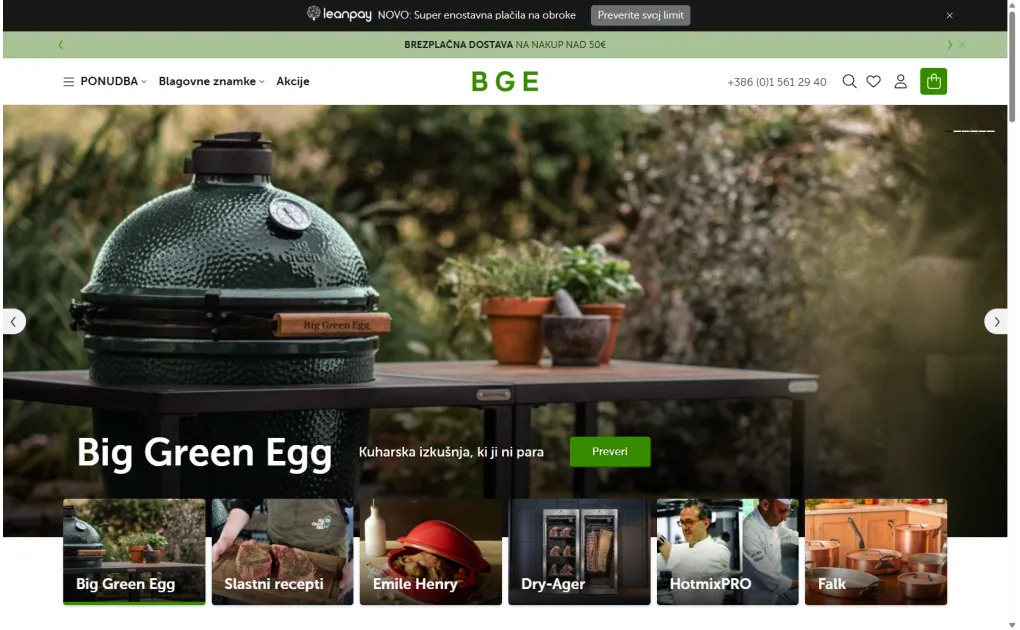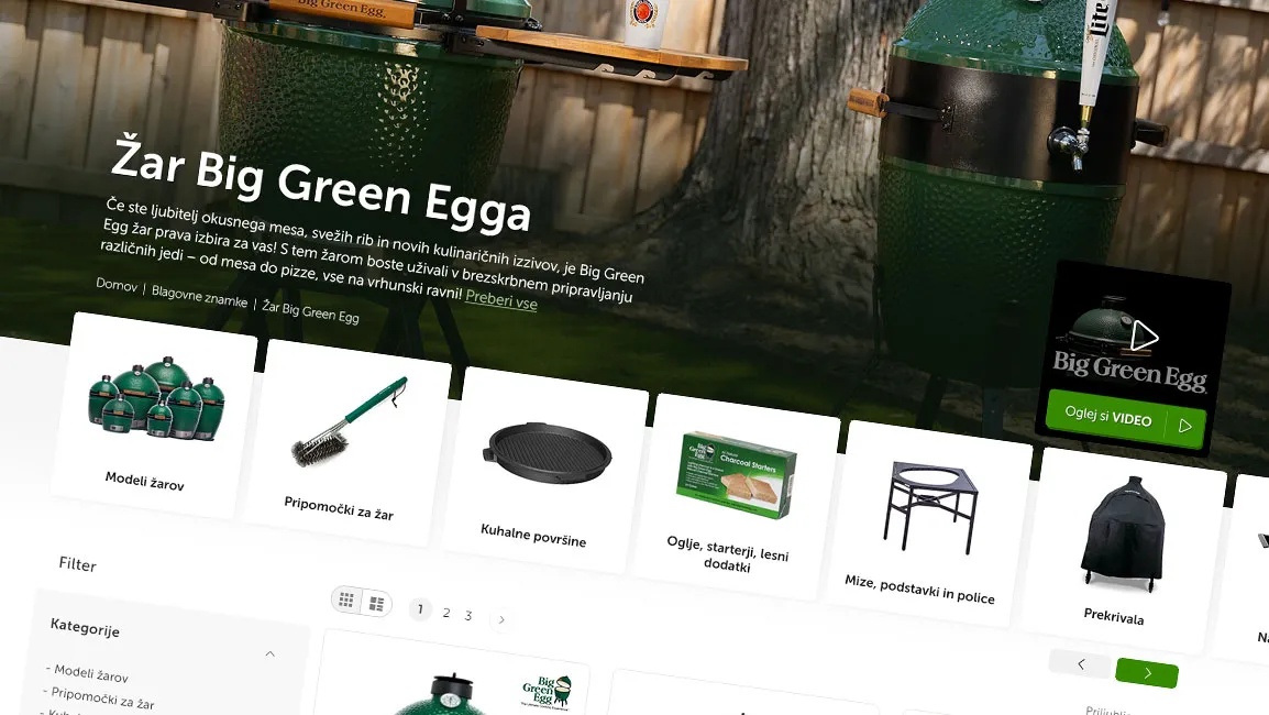
Recently, I offered my newsletter readers the opportunity for a free graphic draft of their online store. One of the topics that immediately caught my attention was an online store with cooking and food preparation accessories. As a passionate cook, I immediately felt that this was an ideal challenge for optimizing the user experience and reorganizing categories. A store offering more than 1000 products was an opportunity to create a better and clearer shopping experience. You can see the redesign result here.
To showcase the improvements, we focused on the grill category, where we introduced numerous changes that significantly enhance the shopping experience. Let's take a closer look at them.
1. Optimized page header: Less is more
Research shows that an online store has less than 5 seconds to make a first impression. The old page header design took up too much vertical space.
In the new design, we organized categories into a smart dropdown menu inspired by Amazon. This approach has several advantages:
- Reduced cognitive load for the user, as they only see the main categories
- More space to display products on the first screen
- Better visibility on mobile devices
- Faster access to subcategories with a clear hierarchy
A special feature is the dynamic promotional banner at the top, which acts as prime real estate for important messages. The merchant can easily adjust promotions and notifications without interfering with the basic page structure.

2. Content optimization for better SEO
Categories in an online store are not just a navigation tool but a key entry point for organic traffic. Each category was enriched with an optimized description that fulfills two important goals:
- Improving SEO positions with targeted keywords, which allows for better visibility in search engines.
- Helping users make decisions by displaying relevant information that makes their choice easier.
To enhance the user experience, we implemented an FAQ schema, which is not just an SEO trick. Research shows that users are more likely to trust pages that answer their questions before purchase. We also improved navigation using breadcrumbs, which reduce the number of clicks by 15-20% and significantly improve page orientation.
Additionally, we added more content to the category page, now separated between the top short description and the bottom longer section, which is more graphical and includes additional information such as related blogs, FAQs, and other content that helps users make decisions and increases their trust.

3. Visual display of subcategories: Faster decision-making
Eye-tracking research has shown that users process images 60,000 times faster than text. Our new design displays subcategories with images in a single row, bringing numerous advantages:
- Reducing cognitive load, as it allows users to quickly visually recognize options.
- Accelerated navigation, as images provide an immediate insight into subcategories without the need to read long text.
- Improved user experience on mobile devices, where images are more effective in guiding users and maintaining clarity.
- Preserving valuable vertical space, allowing for greater clarity and optimized screen usage.

4. Advanced filtering: Reducing shopping stress
In an online store offering more than 1000 products, effective filtering is crucial to prevent analysis paralysis, where users become confused by too many choices. The new filtering system is based on three key principles:
- Progressive disclosure of options, allowing users to focus on the most relevant filters without being overwhelmed by too many options at once.
- Instant feedback with each selection, enabling immediate adjustment of search results and faster decision-making.
- Ability to combine different filters, giving users more flexibility in searching and allowing for more precise results.
Research has shown that well-designed filtering can reduce the time to purchase by more than 30% and significantly increase user satisfaction, as it makes it easier for them to find and choose products.

5. Improved product tags: Visual hierarchy
The new tag design follows the principles of Gestalt psychology, which help create a better visual hierarchy and clearer information transfer:
- Brand logos in the upper right corner, allowing for immediate recognition and quick user orientation.
- Contrasting tags for promotions and novelties, which stand out and attract attention, so users quickly recognize important information.
- Option for additional tags, such as Masterchef recommendation, bestseller, and others, which further highlight product features, such as popularity, recommendation, or exclusivity.
- Consistent layout, allowing for easy page scanning and quick detection of key information.
This organization of information reduces cognitive load, allowing users to make faster and easier purchasing decisions.

6. Content integration: Contextually relevant information
Related content is not just an additional content element – it is a strategic way to help users make a purchase decision. For example, if we have a grill category, we can offer related blog posts alongside products, such as "How to make perfect ribs on the grill." This not only shows users how to use the product but also provides inspiration for new ideas and usage possibilities.
By integrating these contents, we achieve several advantages:
Increase trust in the decision, as we provide relevant and useful information that helps them choose the right product for their needs.
Increase interest and engagement of users, as we offer them concrete ideas and tips for using products.
Encourage purchase, as users receive additional information on how the product could improve their lifestyle, for example, how a grill can become part of family enjoyment over food.

7. Remaining elements: Building trust and encouraging further interaction
At the bottom of the page, we included several conversion elements based on proven principles of behavioral psychology and user experience to increase visitor engagement:
- Benefits bar: We added a visually highlighted bar with key information, such as free shipping, a wide range of products, and expert assistance, which immediately attracts attention and further encourages users to purchase. This bar offers visitors important advantages that make them feel safer and more confident in their purchase choice.
- Newsletter signup with rewards, such as PDF recipes and exclusive benefits. This approach offers users immediate value, increasing the likelihood of them signing up. For even better results, consider adding a recipe booklet or 20 ways to use the Big Green Egg grill to offer visitors even more useful content that would further motivate them.
- Brand display with direct links to brand pages, where users can explore more products and get acquainted with a diverse range of offerings. This increases trust in product quality and allows easy exploration of additional options offered by trusted brands.
- Clearly structured store information, allowing visitors to quickly and easily find all important data. This increases transparency and reduces potential doubts, which consequently contributes to greater visitor engagement.

Although creating a graphic draft is often a time-consuming process, by using proven UX principles, we managed to create an effective initial version that already brings concrete improvements. Of course, some adjustments and changes will still be needed, but the new design not only improves the user experience but also lays a solid foundation for higher conversion.
Are you considering redesigning your website or store? Write to me for a free consultation, maybe the next graphic draft will be prepared just for your store, and together we will create an even better user experience and results.