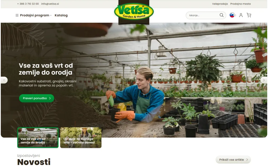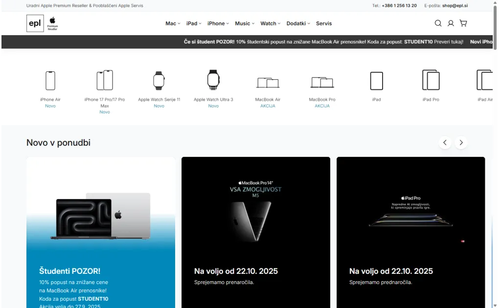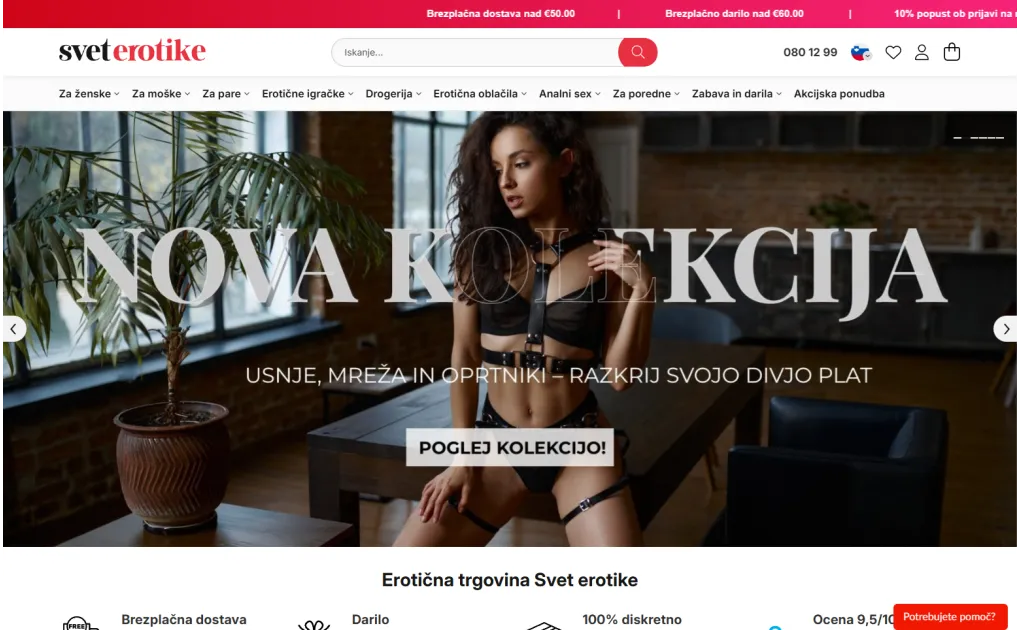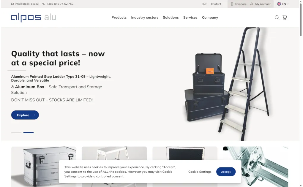
New website or upgrading an existing one? Book a free video consultation.
Englishen
Login Configurator

Mobile websites and stores

Mobile websites are a new sales hit, which has also been endorsed by the giant Google. Since April 21, 2015, Google's logic of evaluating your website and placing it in search results on the search engine also includes the mobile version of the website. Here is your opportunity to gain extra points and surpass your competition!

Mobile websites and stores

What is a mobile website (mobile page or store)?

We are all familiar with websites and online stores, but mobile websites are actually versions of websites or stores that are adapted for smaller screens of mobile devices. It has been observed that there are more visitors using mobile devices online than desktop or laptop computers. If your website is not optimized for smaller screens, you are actually losing potential customers and assisting your competition. A mobile website can fix this, as it is adapted to all smaller screens of mobile devices and properly displays the content of the store or page.
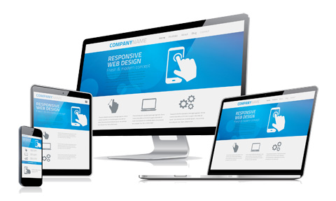

mobile online store
mobile web page

Why can creating a mobile store be beneficial for you?

  • You will have a higher ranking on Google.
  • Your reach to the target audience and customers will increase.
  • Your website will be optimally displayed even on smaller screens.
  • Advanced marketing will also be enabled.

Why is creating a mobile website essential?

As the use of smartphones and tablets is on the rise, creating a mobile website is actually essential in today's time. A mobile website has a different display format compared to a regular website, so it also has adapted content and functionalities that are displayed on all mobile devices.

If you are still considering creating a website, it's good to think whether you would opt for responsive design or a separate mobile website. Responsive design does not earn extra points on Google, so a mobile website can be your advantage over others.

creating a mobile website
Frequently Asked Questions

Why is mobile responsiveness so important?

More than 60% of web traffic today comes from mobile devices. If your site is not adapted to mobile screens, you are losing the majority of potential customers. Google guidelines prefer responsive sites, which typically results in better search rankings.

What is the difference between responsive and mobile design?

Responsive design automatically adapts to all screen sizes with a single design. A mobile version is a separate site for mobile devices. We recommend responsive design - easier maintenance, better SEO.

How do I check if my site is mobile-friendly?

Use Google PageSpeed Insights or Google's Mobile-Friendly Test (search.google.com/test/mobile-friendly). You immediately see where the issues are.

Does mobile responsiveness affect sales?

Directly - customers who do not have a good experience on mobile leave. Improved mobile experience typically brings a 20-40% increase in mobile conversions.

How long does it take to adapt an existing site for mobile?

It depends on the current state. Minor fixes to an existing responsive design take 1-3 days, a complete mobile experience overhaul takes 1-3 weeks.

Stop browsing. Start selling. Contact me now at anze@degriz.net.

Access Premium Content for Free

Subscribe to our newsletter and get free access to premium content. Discover valuable insights and exclusive resources available only to our subscribers.

Privacy Policy: Newsletter Subscription

By entering your email address, you are subscribing to the newsletter, through which Degriz will inform you about new online and in-store offerings, marketing activities, and other promotions.

By subscribing to the newsletter, you are also enrolled in the benefits database that Degriz offers to its users.

For the newsletter subscription, Degriz d.o.o. collects the following information: email address, IP address, and if you subscribe as a registered member, your name, surname, address, and phone number.

After submitting the form with your email address, you will receive a confirmation message at the specified address – by confirming this, you will be subscribed to the Degriz newsletter until you unsubscribe (so-called opt-in approval). You can request, in writing or by clicking the Unsubscribe button in the newsletter, that the data controller permanently or temporarily stops using your personal data for direct marketing purposes. Your request will be fulfilled within 15 days of receiving it, as prescribed by law. You can also request the transfer or access to your data.

Degriz d.o.o. is committed to protecting your data in accordance with the legislation governing personal data protection.

The sender of the newsletter and controller of your personal data is: Degriz, d.o.o., Gorica pri Šmartnem 45a, 3000 Celje, SI 67287743

Check out the full Privacy Policy

Newsletter

My name is Anže, and I am a Magento certified expert in solutions and a creator of multiple award-winning online stores.

I am the architect behind all Degriz projects. You will surely come across me if we collaborate. Even though the phone keeps ringing, you can always tap me on the shoulder if you need advice regarding online stores and their functioning.

I specialize in building custom online stores and I am a master of unique techniques to enhance conversion on your website.

© 2010 - 2026 Degriz. All rights reserved. Built with love on Magento.
Partial use of the content is permitted with mandatory attribution. The content is licensed under Creative Commons Attribution 4.0 International (CC BY 4.0) or under our own license.