One of the most common mistakes is cramming too much content into a limited space. While the goal is often to showcase as much as possible in a small area, it's sometimes better to omit certain elements for a more quality presentation of the selected content.
Allowing elements to breathe is achieved through appropriate spacing and margins. When designing the layout, defining edges within which elements can be placed is essential. While spacing online may not be as critical as in printed media, where elements can be lost due to printing and trimming, it still plays a crucial role.
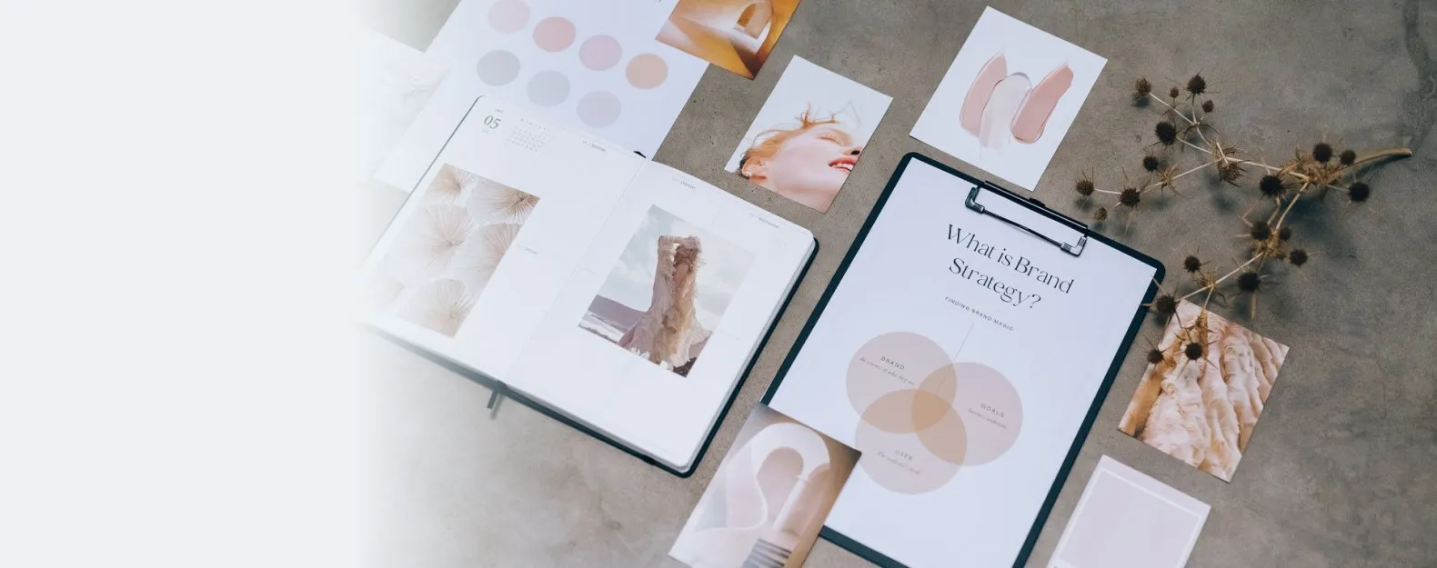
If graphical elements, such as photos, are added to the overall design, it's crucial to ensure that they don't draw more attention than the intended content.
When choosing photos, make sure they don't have cropped key parts or elements that distract attention. For example, in a watch product photo, include the entire watch face; in a photo of a woman's shirt, capture at least the entire upper part of the woman's body. A tip for photographing people is to have them not look directly at the viewer but rather at the headline or advertised product.
For longer design works, consider breaking them into paragraphs similar to how you would structure text. Use a zebra pattern or zig-zag layout for graphic separation between different sections. This visually distinguishes individual sections, making it easier for quick content review, as people tend to follow a zig-zag pattern during rapid content scans.


