The homepage is the most important page of the online store since it's usually visited by the most visitors.
Because of this, it must make the right impression on the visitor to keep their attention. People make decisions quickly, so you must show the most attractive elements on the first screen. Avoid displaying unnecessary elements that distract from the essential content the visitor is looking for. In the case of an advanced system with built-in artificial intelligence and a larger dataset about the visitor, including their habits, history, preferences, and personal choices, you could streamline the entire page to be similar to Google's homepage, showing potential items the visitor is looking for alongside the search bar.
Since that's not the case, you need to present your offerings differently. Typically, the homepage features prominent banners, often displaying current site-related events - promotions, new items, or ongoing special offers. It's all very similar to traditional displays in a physical store.
Below the banners, there is also a selection of individual items from categories presented in the form of separate sections that you can display in various ways (with tabs or individual page sections). If possible, ensure that these are visible immediately when the page opens, without the need for unnecessary scrolling.
You can organize the selection of individual items in various ways, with the most common being the seasonal highlighting of items, promotions, and new items. You can also highlight specific categories of items. Start with the most important ones, typically the most visited, and those that bring you the most sales conversions, and then proceed in order.
For first-time visitors and those who have no online shopping experience, it is necessary to establish the credibility of the online store, especially its security when highlighting current items.
Credibility can be improved with special highlighted elements that give the buyer a sense of security, such as a secure page and its data, the option to return items, ease of purchase, fast delivery, or the service of delivering ordered items, and more. Of course, it's not bad to introduce the retailer as well because this way, the visitor learns who they are dealing with, and the shopping experience becomes more personal.
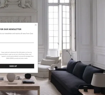
Give the visitor a reason to sign up (e.g. a guide, a sample or the first notice of news) and state clearly on the form what they will receive. Do not add them to an advertising list without explicit consent and do not track them covertly. More in Online store legislation in the EU.
Frequently asked questions
The homepage is the most visited page of your online store and often the first impression for a new visitor. Within the first seconds it must clearly communicate what you sell, why to buy from you, and what the visitor should do next.
A clear headline (what you sell), featured categories or bestsellers, a promotional offer or USP (why you), trust elements (reviews, certificates, media logos), and a clear call to action (CTA button). Navigation must be intuitive.
The homepage should be focused - not too long, but informative enough. The main goal is to direct the visitor forward to categories or products. Too-long homepages scatter attention.
Regularly - at least for seasonal promotions, new collections, and holidays. A dynamic homepage (with current offers) is more engaging than a static one and can encourage return visits.
The homepage is the most important page for brand and brand keywords. Proper H1, meta tags, internal links to key categories, and loading speed are the key factors.

My name is Anže, I am a certified Magento solution expert and the maker of several award-winning online stores. I am the architect of all Degriz projects.
Write to me →







 Reading