Categories are individual areas of the online store and encompass a varying number of items. On a category page, items are usually presented in a grid or list format. Depending on the items, we can use different displays or allow the visitor to arrange the display according to their preference. Of course, there are other layouts, but these are classic for categories.
The item grid is usually used when we want to display more items, as we can fit more in a row (2,3,4,5,...), all depending on how large we want to display the items. The larger the items, the fewer will fit in one row, allowing more space for arrangement.

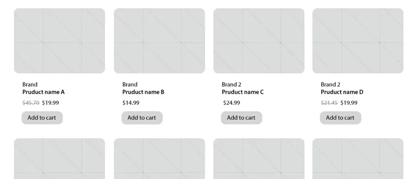
Display in grid and list format
The item list is usually used when we want to show more information about the items on the page.
Usually, we display the image, price, name, and a button to add to the cart or view details from the item elements. Additionally, we can add a quick preview, wishlist, comparison, and individual item tags.
Image display
How we present items mainly depends on the items themselves. Let's look at examples of items that differ significantly in photography: photographing glasses and wristwatches. For watches, we usually have vertical images for better display, while for glasses, we photograph items in a horizontal format. If we have only one type of item, we will, of course, choose the display that is most suitable. If they differ, we will have to make a compromise, for example, by displaying square images. In this case, watch images would have white space added on the sides, while glasses images would have it added above and below.
Additional item highlighting
Individual items are particularly attractive in categories, so we can highlight them more with different tags. Even in classic stores, we can see various marketing elements on shelves that highlight items. Usually, these are tags like new, sale, discounted, recommended, and similar. We can be quite creative with these things, but if we run out of ideas, we can always visit a store and borrow an idea.
We can also highlight certain items by inserting an advertisement banner among the item list, which can serve additional promotion. We must be careful not to overload the page with information and worsen the user experience by placing ads in the category.
A very good way to attract visitors' attention is to highlight bestsellers at the beginning of the list to draw the visitor's attention to continue browsing the category. Even in classic stores, we usually find certain corners where specific items are specially highlighted and promoted in this way.
Of course, we must also arrange sorting in the category so that the visitor can sort items according to their wishes.
The most common way of sorting items is:
- from newest to oldest (and vice versa)
- alphabetically from A to Z (and vice versa)
- by price from cheapest to most expensive (and vice versa)
Usually, we start with our arrangement by starting with bestsellers, continuing with seasonally attractive items, and ending with those out of stock (if we display these).
Of course, besides the above-mentioned, there are other item arrangements, but everything always depends on the sales method and the items we sell. For example, if we sell motorcycles, we can also sort them by a parameter like power, which is probably quite important when choosing a motorcycle.
Filtering
If we have a larger range of items, it is important to add a filtering function to the page. This allows us to reduce the display of items based on selected item parameters and have only those that match the selected parameters available.
Usually, filtering by price and subcategory is available, but we can add other item parameters, such as filtering by brands, age of use, gender, size, color, etc.
Category optimization for search engines
Categories are usually among the most visited pages by search engines, so it is necessary to optimize them appropriately. It is important to describe the category appropriately with words. We must be careful not to divert too much attention from the items with the category presentation. Therefore, we can add a short description at the beginning and a longer one at the end of the category, or hide it at the top of the page so that it appears with a click on a link, such as "read more".
Of course, we must have a good category name that is searched for through search engines and also a search engine-friendly link to it.
Displaying more items
In the case of a larger range of items, it is advisable, for speed of display, not to show them all at once, but only in parts. For example, we display only the first 24 items, and for the rest, we allow display by clicking on individual item pages or arrange it so that additional ones appear dynamically as you scroll down the page (usually ajax technology is used for this).
You're probably wondering why exactly 24 items? This is a particularly relevant display for me because more and more stores are adaptable, and therefore we must also arrange different displays on different browser widths. The number 24 allows us to arrange them in rows of 4, 3, or 2, without leaving an empty field at the end of the grid.


