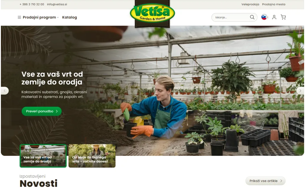
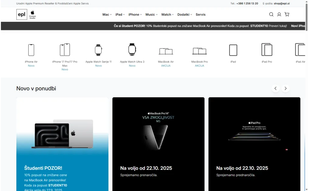
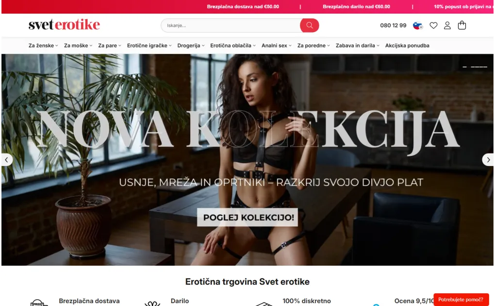
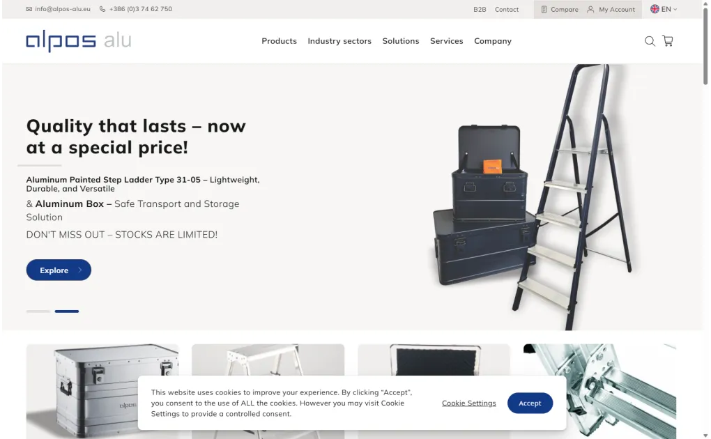
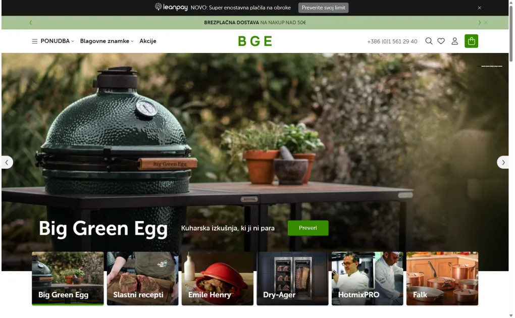
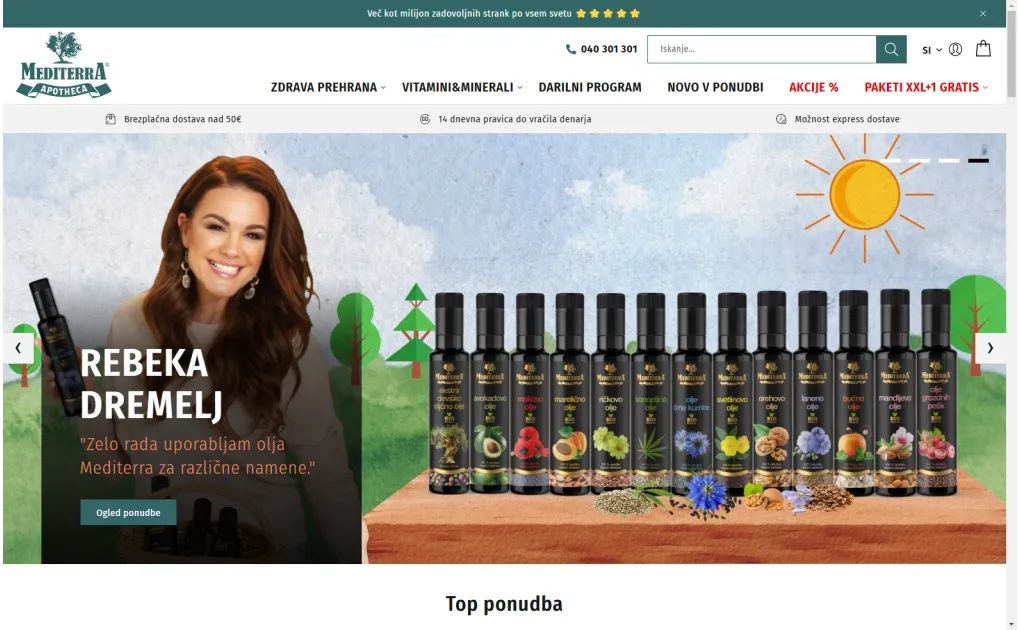
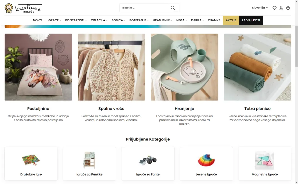
Just below the hero section of the home page is an excellent spot for a bar that briefly answers the question almost every customer asks: why should I buy from you. A key benefits bar gathers, in a few words and icons, the reasons that reduce doubt before a purchase, right at the start of the visit. Because it is visible immediately and understandable everywhere, it acts as a quiet assurance that reassures the visitor before they even start browsing. Below is which benefits to highlight and how to present them so the bar truly does its job.
Which benefits to highlight
Highlight the benefits that most reduce doubt before a purchase: free shipping above a set amount, easy returns, a money-back guarantee, fast delivery, secure payment, or accessible support. These are the questions that often stop a customer from buying if they do not get a clear answer.
Choose three to five of the strongest benefits, not all of them at once. Too long a list loses its power, since the visitor no longer knows what really matters.
Example of a bar with four benefits: "Free shipping over 50 EUR", "30-day no-questions returns", "Secure payment", and "Support every business day". Each item answers one concrete concern of the customer: cost, the risk of buying, security, and reachability.
Short, scannable, and with icons
The bar should be short and scannable: each benefit written in a few words, ideally next to a clear icon that captures its meaning at a glance. The visitor should grasp it in passing, without stopping to read whole sentences.
Example of good versus weak wording: "Free shipping over 50 EUR" says more than "Affordable shipping"; "30-day returns" more than "Returns possible"; "Delivery in 1-2 business days" more than "Fast delivery". A concrete figure, such as an amount or a number of days, is more convincing than a general promise.
The right place on the page
The bar works most strongly just below the hero section, where the visitor's gaze naturally continues. There it also catches those who do not click the hero right away but are still judging whether the store is trustworthy.
The same benefits make sense to repeat closer to the purchase decision, for example in the cart or at checkout, where doubt most often stalls a purchase. That way the assurance accompanies the customer along the whole path, not just at the entrance.
Truthfulness and consistency
The benefits you highlight must be true and consistent with what you actually offer. A promise of free shipping or easy returns that later turns out to be conditioned by fine print quickly dispels the trust you gained with it.
It is also important that the messages are consistent across the whole store. If the bar promises one thing but on the shipping or returns page the customer reads another, a sense of unreliability arises.
How to set it up in Magento
In Magento you usually manage the key benefits bar as a static CMS block that the theme shows on the home page, and on other pages if you wish. This approach lets you update the content and icons yourself at any time, without touching the code.
For more advanced options, for example showing benefits based on the cart contents (such as "You are 6 EUR away from free shipping") or a live counter of shipped orders, a dedicated module is required. In most cases, however, a simple static block is enough for the bar.
How to measure whether it works
The effect of the bar is harder to measure directly, since it rarely triggers a click, but it is useful to track how its presence affects conversion and the bounce rate on the home page. The bar often works in the background: it reassures the visitor and keeps them longer.
You can test different sets and wordings of benefits and compare the results. Sometimes even swapping one benefit for a more convincing one, or clearer wording, noticeably changes visitor behaviour.